Si Scott, born in 1977 in Leeds, is an illustrator and graphic designer who developed an interest in drawing from an early age.
After leaving school at sixteen Si went to Leeds College of Art and Design to study graphic design for two years and then after that he completed the one year foundation course. And to finish his studies he did a degree in graphic design at Buckinghamshire University College.
His work is based in modern typography, he started making the embellishment of letters and words and then he went on to drawing animals, figures, logos and advertising like for example for Nike and Adidas as you can see in this pictures.
With a thin black gel pen he makes all of this by hand, making the curves and the lines forming the shape and the form of the figure like the “Sea Horse” in the right.
In the 19th page of my sketchbook I made a A4 copy of this image, using a thin black gel pen as well.
Form the Rare Books from the
Jesuit Oregon Province
The idea of embellishment of letters started a long time ago, how you can see in some antique books and bibles where the first letters are bigger than the others with embellishments around them like this picture on the left.
Michael Craig-Martin, born in Dublin, 28 August 1941, is a painter and contemporary conceptual artist and is also a Emeritus Professor of Fine Art. Paul and Rhona, his Irish parents, who lived in London, wanted their son to be born in Ireland, and went to Dublin for the birth and then returned to London.
In 1945, the family moved to Washington D.C. and he was given a religious education, in the English Benedictine Priory School, he was encouraged to look at religious imagery in illuminated glass panels and stained-glass windows. He gained an interest in art through one of the priests, who was an artist. Drawing classes in the Lycée with Antonio Roda, gave him a wider perspective on art and in the fall of 1959 began a painting course at Yale College.
In the 60’s during the Vietnam War, Craig-Martin received a offer to a job in England, he needed money so the artist moved to England again.
In the 1980s, Craig-Martin was a tutor at Goldsmiths College, Department of Art, He was a significant influence on the emerging YBA generation, including Damien Hirst.
I really enjoy the work of this artist because of the bold colours and disorganized shapes. I like bold colours as well and I like when I make a piece of work that makes me feel good and happy. In this Mural Project I will try to incorporate some bold and happy colours and simplified shapes, so this research was really helpful to my project.
In the 23rd page of my sketchbook I copied this picture, in the right, using acrylics.
This image, called Yellow, is part of the installation 'Inhale/Exhale' by Michael Craig-Martin and as you can see in this picture there is a large light bulb in the centre, a globe without mapping detail, a metronome, an oversized pencil sharpener, a plastic chair, an ice cube tray, a cassette tape, an empty filing cabinet, and in the background a step ladder and a drawer extracted from a cabinet.
Michael Craig-Martin with this image wants to explore and show the details of these household objectsrather than hiding them, this is evident with the two drawers in the background where they are lining forward so the viewer can see the detail inside.
This image has a happy and alive mood and the atmosphere is a little bite messy. It seems almost like a disorganized studio or an attic and all of these colours convey feelings of joy and happiness in the viewer.
The subject matter of this artwork is the art work itself because its all about line, shape, perspective, colour and, mostly important, composition.
The artist starts by making a sketch and marking carefully the lines of the simplified objects on a canvas before he adds the acrylics, using thin and mat paint, finally he makes the black lines with a thin brush. In some exhibitions Michael paints directly on the walls of the galleries and he not only uses acrylic paint but many other methods, such as using black tape to make the lines.
Because of the different angles and perspectives you can see some depth in the ice cube tray and the drawers for example. Some objects seems like the viewer is above them, like the pencil sharpener and some others objects seems that the viewer is in front of them, like the metronome. You also can see that some objects are further away than others, and the sizes were close to the reality. The painting has a smooth texture and the pastels colours are exaggerated and not close to the colours of the real objects, and because they are bright and bold colours the paint doesn’t have dark areas and all of these convey happiness and joy to the viewer.
Richard William Hamilton, 24 February 1922 - 13 September 2011, was a British painter and collage artist.
Hamilton is from Pimlico, London, left school early with no formal qualifications, and started working as an apprentice at an electrical components firm, where he discovered an ability for drawing and began to do painting at evening classes at St Martin's School of Art.
After two years at the Slade School of Art, University College in London, Hamilton began exhibiting his work at the Institute of Contemporary Arts (ICA) where he also produced posters and leaflets and started teaching at the Central School of Art and Design
His 1956 collage, “Just what is it that makes today's homes so different, so appealing?” is considered to be one of the early works of pop art.
In the 7th page of my sketchbook I did a collage inspired on this image and in Richard William Hamilton's work.
In this image you can see a room with a excellent layout and some surreal choices, for example the moon in the sealing and a lollipop in the hand of a bodybuilde, the naked woman in the right, the stairs in the left, a collage that even with a realistic layout, the pictures selected have no relationship between each others.
Pop art emerged in 1950’s in Britain and is an art movement of the twentieth century characterized by bold and innovator themes and techniques drawn from popular culture and began more as comic books, cultural objects and advertising like, for example, this Coca-Cola poster in the left.
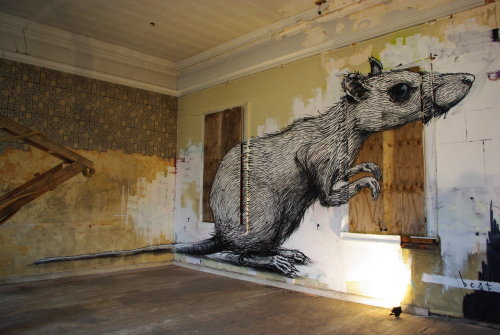
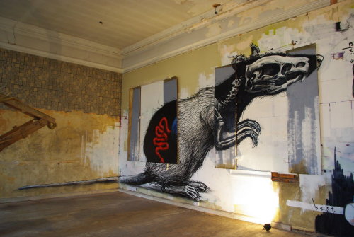
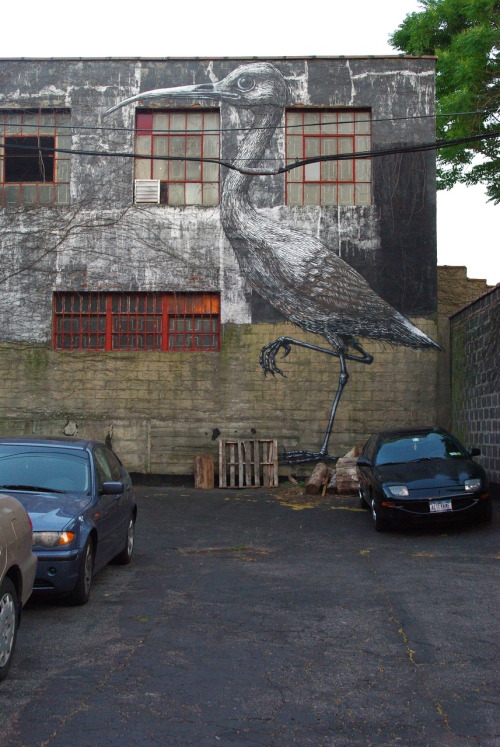
Roa is a Belgian Street artist from Ghent, he is renowned for his big animals, painted in black and white. His work has permission and it is usually done on abandoned buildings, warehouses and unrecognised corners.
In the 17th page of my sketchbook I copied to images of this artist. Roa’s animals have such detail and he paints with normal paint and pencils, and he makes the white background first and then draw the details with the black.
In the picture above you can see a crane (bird), this giant crane is on Hanbury Street. You can see the detail of the wings and the legs. He is an amazing artist an amazing drawer, sometimes controversy by the macabre animals, like in the pictures on the left, when you can see the bowels and the skeleton, and this pictures are a good example of how some of this artist’s work is interactive, as you can see when the windows are closed the animal is normal, but when you open the windows you can see insides the animal.
Exhibition Brighton Prescription
Art present ‘Best Ever’ vs ‘ROA’
“Graffiti is one of the most free art expressions of the world; you don’t do it for money nor for an institution, it’s free expression and it liberates yourself creatively from a lot of restrictions”
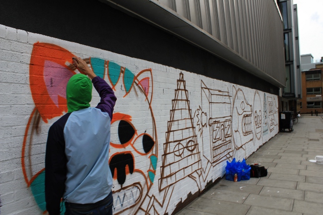
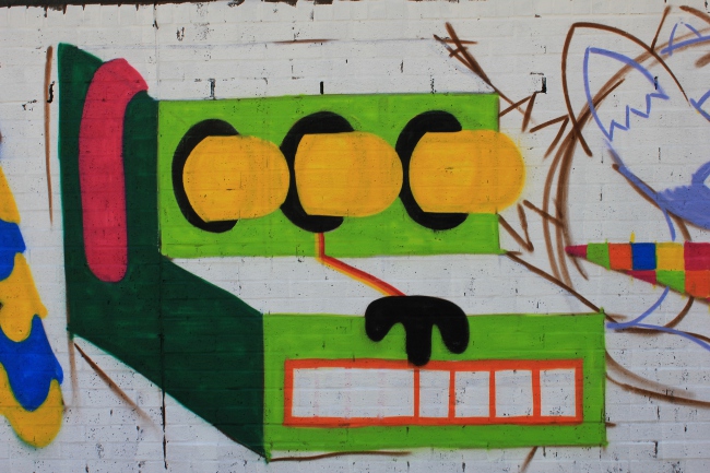
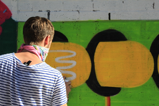
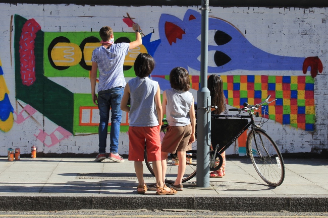
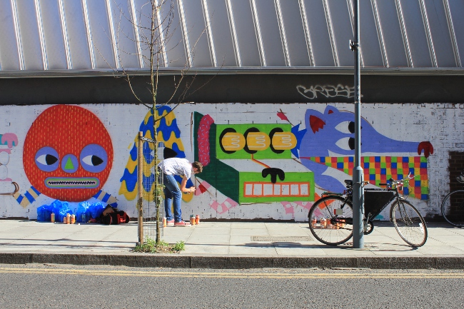
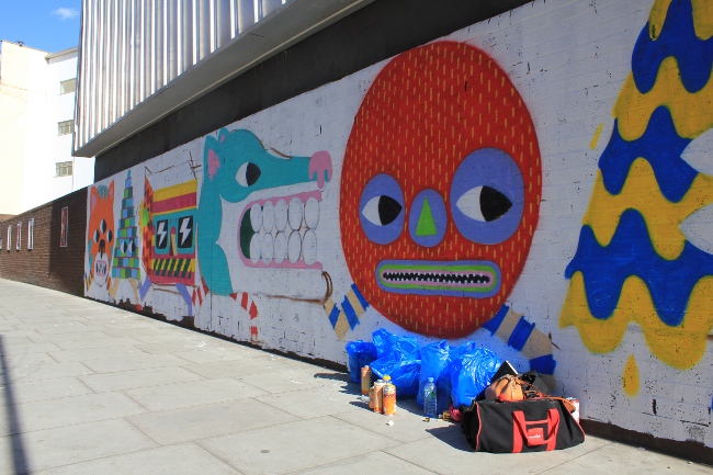
Malark, as known by Malarky, is a Spanish street artist and illustrator from Barcelona, and his work is known by the vibrant and colorful illustrations that you can see in London and in Barcelona.
Drawing since a child, Malark became a graffiti artist after he started skateboarding as a teenager.
Floaty Stripe Wolf
In the 16th page of my sketchbook I copied three litle characters of this artist. He has a mission to achieve with his graffiti, that is making the people smile, and in my opinion he is successful, because when you walk down the street going to work or coming tired of work and see this vibrant walls like this picture in the left, with this colorful and happy creatures, you defiantly smile and take a photo. His work is for all kind of ages and ethnic groups, the children and adults love his work.
London Truck Tings
He also paints in shops shutters, as you can see in the picture above, and in trucks, in the right. He makes everything more fun and alive with his colorful characters influenced by letters using graffiti paint and drawing everything by hand.
Kara Walker is a comtemporary African American artist born in Stockton, California in 1969 and received a BFA from the Atlanta College of Art 1n 1991 and an MFA from the Rhode Island School of Design in 1994.
She is known by her amazing silhouettes exploring race, gender, sexuality, violence and identity.She create a theatrical space in the walls of the gallery with the cut-paper characters. She generlly uses black paper for the characters and places them in the white wall or vice versa, but in some of her work the artist uses projectors to throw colored light into the ceiling, walls and floor of the exhibition space and when the viewer walks into the installation, his or her body casts a shadow into the walls where it blends with walker's black-paper figures.
Kara Walker's work has a historical dimension but also we can see one strand of romantic fantasy.
In the 3rd page of my sketchbook I copied this image of Kara Walker, on the left, changing the colours, using black for the backround and white for the characters.
In this image we can see a man being carried by one of his slaves as his mistress, also a slave, makes him company. This image shows perfectly what happened in that time, a time of slavery, where mans were used to work and women were used not only to work but also as sexual objects or lovers of their "owners"
 Si Scott, born in 1977 in Leeds, is an illustrator and graphic designer who developed an interest in drawing from an early age.


